Thursday 19 April 2012

Sculpture Project Part 2

I began the second half of my project by making this piece. Initially I planned on just getting a pillow with wax dripping off of it, to tie in with my previous piece, like someone sweating this substance in their sleep. instead i took out the stuffing and let the wax obscure and freeze the pillowcases' shape, like it's taking years of this substance dripping on it.

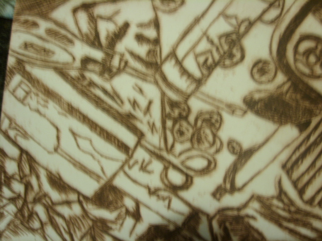
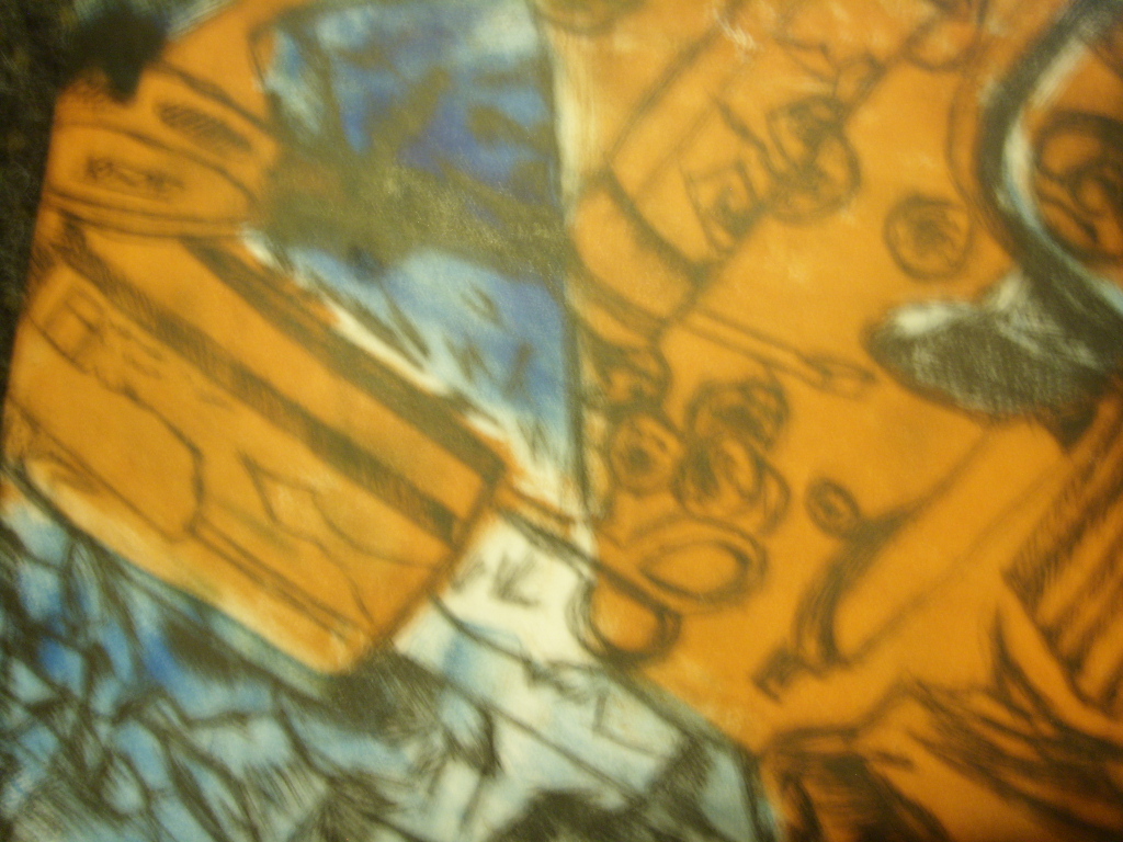
Because I didn't use the stuffing from the pillow I put it in a plastic bag and decided I would use this as my next piece. The inner structure of the material in the bag had an interesting form that I could look at in more detail.


These are photocopies of the stuffing inside the plastic bags. It gives us a great 2D image of the 3D insides of the filled space. The shapes in this inspired me to create a piece with similar texture, shape and dips as we see in this picture,

Using plastic bags which have been inflated an constricted with twine and wire in certain ways I created this piece which has depths and textures similar to the scans. In the centre is a wire mesh with the plastic bags attached to that. The inflated bags are tied closely together. This process gives the image of one large object with many contours and dips rather than many seperate objects.

Monday 2 April 2012

Sculpture Project Part 1

The brief we received about our Sculpture project for the next few weeks was about re-thinkng and re-engineering the human body.


The first of the concepts i looked at was the removal of toxins from the body. What if the body got rid of all toxins and poisons in the body through the skin? Like trails of gunk from peoples bodies. This re-think of how the body could work lead to these dripping objects. with a pale, off white substance dripping off them. They were made by getting thick twine, tripling it up and tying it at both ends. I then get a cup, fill it with wax, let it cool for a while so that when it pours, it becomes solid before it drips.


These stalagmite like formations continued on to a idea I had where the substance appeared to be flowing from a persons pores. The textures are what i am going for. They're gloopy and strectch towards the ground with movement.The largest of these is covered in Vaseline to give it a slimier, slippy and shiny texture.


The fingers are distorted, the puss coloured substance has no single source but rather comes from everywhere at once. the fingers are distorted, as if moved by the pressure of the liquid inside the hand.


The second piece is also of a hand but with intact fingers. It is also a plaster arm but with plastic bags and wax covering it. It has a covering which is trying to contain the outpouring of liquid.

Monday 12 March 2012

Sculpture My Top Ten artworks of the Human Body

 10. Daniel Firman - Excentrique

                                         Plaster, clothing, various objects,   2005


9. Christine Bourdette - Totem
 Found wood, plaster, sheet metal, paint. The art gym at Maryhurst University, 2008.

8. Carole Feuerman - Psyche
Bronze, 2005

7. Eric Fischl - Tumbling Woman

                                           Bronze, 37x74x50 inches 2001

6. Ana Teresa Fernandez - Unititled 1

                                                            Broken Brown bottle glass,  2008

5. Do Ho-Suh - Floor

                                          PVC figures, fibreglass, 32mx32m, 2000

 4. Ron Mueck - Giant Boy


                                         5m tall, Fibreglass, resin, silicone, 2000
3. Patricia Piccinini - The Young Family

                                   Silicone, acrylic, human hair, leather timber, 2002-2003

2. Lin Tianmaio - Mother no.12-1

                                             Fibreglass, silk, 2008

1. David Altmejd - The Giant

                                                         3.4 metres tall, mixed media, 2006


Thursday 1 March 2012

Graphic Design- Illustrative Project

For the week 2 illustrative project I was still working with the 'A Hail of Bullets' metaphor. An idea I began with was bullets a tablets, Being the same shape, in this context it could represent the overuse of tablets in modern society.


I then took the imagery towards a religious worshiping kind of feel. The idea was to use this side of the word hail in relation to bullets.


After this I saw figures used in a magazine to represent the efficiency of workers. They we're very basic but looked like slaves in egyptian hyroglyphs. I used similar figures carrying bullets to portray the slavery brought on by guns and the power they can hold over people.


My last idea is a hierarchy of power, ranging from a homeless man up to a king and queen which is below a bullet, signifying the hail bullets concept with bullets having more power and influence than people.

Monday 27 February 2012

A Hail Of Bullets- Graphic design Typography project

I started my typography project by looking at possible wordplay within the metaphor 'A Hail of Bullets'  The word hail could also be used in the weather sense with the word 'Bullets' being the hail that's falling

I also made an animation where the word bullet is being fired from the word of. A Hail of makes up the figure of the man in this picture.

Also playing on the more literal meaning of Hail of Bullets I made a bullet hole version of the metaphor.


I also looked at playing around with the lettering like i saw in a graphic design magazine where the I from hail drops down to become the second L of bullets


Another offset from the hail and weather connection was the use of the words 'A Hail of'' as the cloud and bullets in very small size to represent the hail.


My final idea is the words 'Hail' and Bullets' in a different colour which changes the meaning of the metaphor to a statement about the addiction to power and power of firearms. The words Hail Bullets are faintly behind to symbolise a type of subliminal messaging which is used to create a fascination with guns and their power to kill

Thursday 9 February 2012

Printmaking

As part of my printmaking elective project I looked at the barries and fences which define the spaces we live in and restricts our movement within them.


I took photos of nearby car parks, the gate from my apartment cmplex to the street, the fence surrounding a rugby pitch and a gate leading to some overgrown vines and plants. My idea was to use the bars in the front of the pictures in the prints over the backgrounds.

I set about monoprints working of these photos with different layers and colours on each to try to create depth and a feeling of the objects behind the bars being out of reach.


I also looked at the outside view of a barrier around a window of an apartment. Although it's meant to protect those inside, when viewed from outside it looks like it's trapping them inside.


For my mini project on clutter I looked at objects crammed together.


I based my prints off the 3rd photograph.


 The first two we're just etching with the bottom two being mono printswithe the etching printed over.